Identity humanitarianism and destructive competition
In my last post, I said that lack of competition is a flaw in the humanitarian system. I should have been more precise. Pointing to regular scraps between UN agencies, one reader wrote that there is actually no end of competitive squabbling. He is, of course, right. There’s plenty of unhealthy competition about funding and institutional turf, but too little of the healthier kind that could drive agencies to do a better job on the ground.
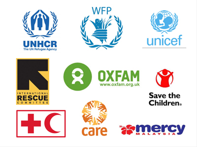
A striking manifestation of negative competition is the proliferation of logos trumpeting an agency’s or a donor country’s contribution. This kind of branding is accepted without question. But does it serve a useful purpose or aggravate what the Humanitarian Policy Group’s report, Time to Let Go, describes as ‘destructive competition’?
The biggest argument for the defense is that prominent identifiers of relief workers, their vehicles and facilities can save lives. An example is the roundel of the International Committee of the Red Cross that provides something of a shield in dangerous places thanks to the agency’s track record of neutrality and even-handedness. The UN’s famous emblem and light blue livery used to offer some measure of safety but its protective value is no longer what it was.
But are other drivers of logolization equally compelling? Fund-givers and fundraisers play a major part in the explosion of flag-waving, virtual and real. Most donors require their grantees to respect strict protocols on adorning food bags, tents and assorted relief items with logos and strap lines that underline the generosity of the people of the United States, Japan, China, the UK, the European Union, and so on.
It is human nature to hoist your standard to indicate ownership, assert domination or demonstrate intent. In the context of international aid, the goal is mainly to draw attention to presence or beneficence. Whatever the motivation, there is little evidence that emblems and logos do much to encourage either greater public support for aid or better humanitarian programming. Perhaps there is a correlation between the number of times your logo appears in the media and the amount of money you raise or can justify giving. If there is a study to prove it, I’ve not seen it. But the assumption that flag waving works drives branding on everything from tents, vehicles, and water towers to caps, T-shirts and even penknives. No surface, it seems, can escape the inevitable logo.
While the security dividends are dwindling and other benefits are unproven, the negatives are worth underlining. Drawing attention to your particular contribution or your presence says nothing about the difference you make. Furthermore, it flies in the face of the collective effort that should underpin humanitarian endeavor. More important, it can exacerbate unhelpful rivalries between aid actors as they vie to draw attention to their particular contribution rather than their common purpose.
The biggest negative of today’s rash of logos and emblems is that it reinforces the unequal power relations between benefactors and beneficiaries. There’s a stark contrast between the constantly reaffirmed identity of the aid providers and the anonymity of the beneficiaries.
It is time to shift the focus from the provenance of inputs to how people receiving aid experience its outcomes. The enthusiasm for branding might actually help if T-shirts had staff names on them and logos included numbers to call with suggestions or complaints. That would provide a silver lining to the clouds above today’s humanitarian LOGOLAND.
